 |
| Step 1 |
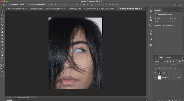
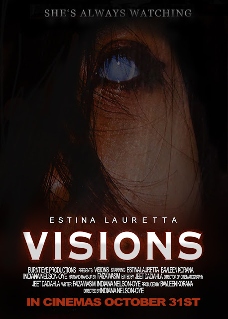
When creating my film magazine, I used a medium angle shot of the character, Jenna Johnson, therefore in order to abide by a house style, I decided to use a close-up shot of the character when creating my film poster. I decided that the film poster should focus on the characters eyes as the eye is a direct representation of the title of the film and also indicates to the audience that the narrative of the film will focused around it. I therefore slightly cropped the image of the character and zoomed into her face once I inserted it into Photoshop.
 |
| Step 2 |
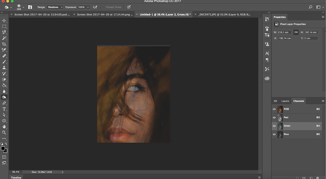
In order to give the image a darker effect, I used the burn tool on Photoshop which allowed the features of the character to stand out more. The burn tool brightened up the eyes of the character and gave it more of a ghostly effect which overall gave the image an eerie feel.
|
|
 |
| Step 3 |
|
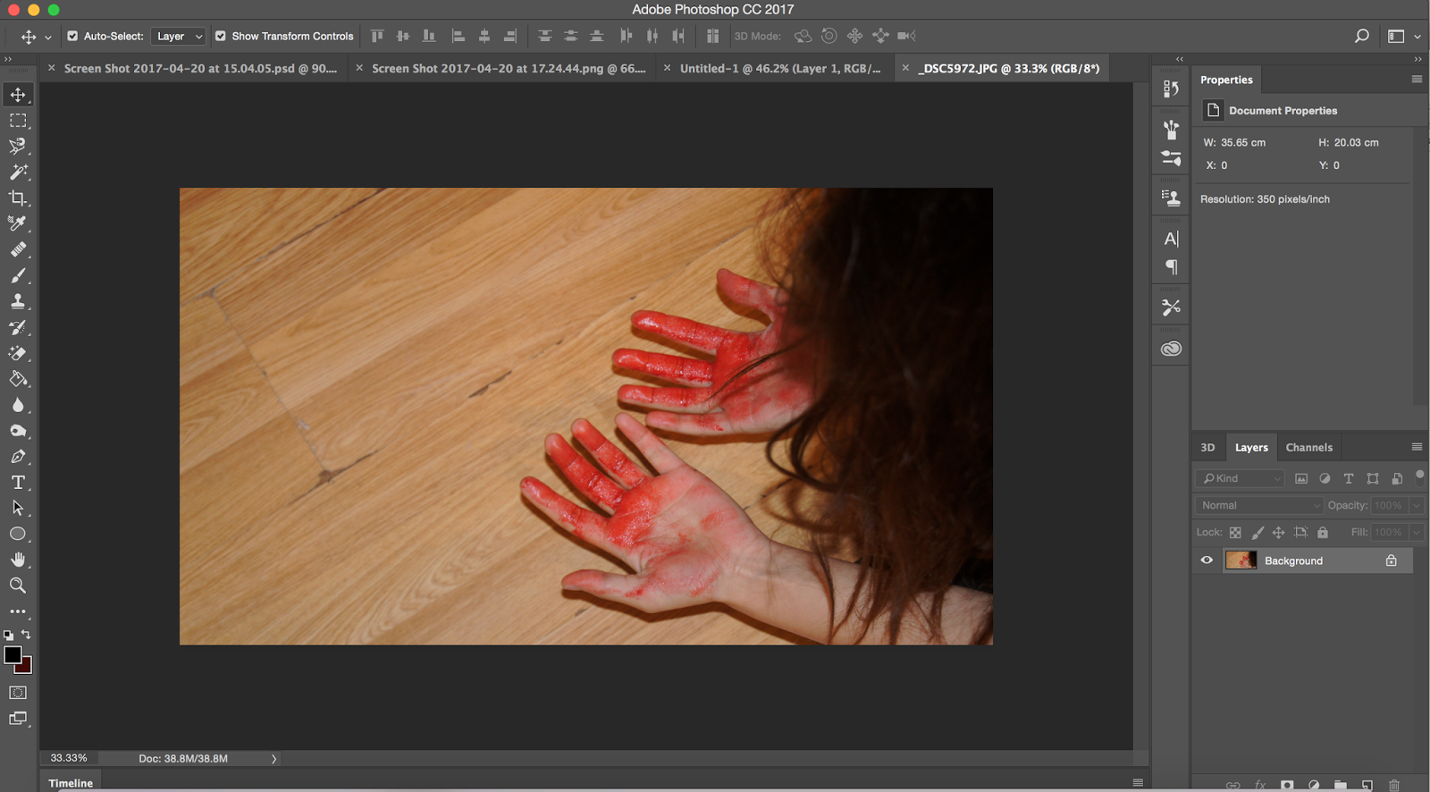
The first image presented above shows me looking down at both of my hands which are covered in blood. I decided to experiment and place this image over the previous one of the character. I then zoomed into my hair within the image and decrease its opacity to 43% which gave the image a textured effect.
 |
| Step 4 |
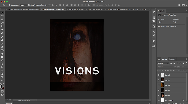
Next, I used the blur tool again, darkening certain parts more than others in order to give the image a more eerie and mysterious feel. Once I was happy with the image, I moved on to creating the title of the film. In order to create a house style, I decided to use the same font style that I used when creating my magazine cover. However, to make the white font stand out, I adjusted the blending options of the font and gave it a hint of a red glow. I decided to use the colour red as I believed that the red would not only compliment the black background and bright coloured font, however, also because it is a colour linked to the horror genre.
 |
| Step 5 |
Firstly, I created the tagline of my film poster; "SHE'S ALWAYS WATCHING". I first experimented with the positioning of the tagline as initially I decided to place in directly on top of the film title. However, I decided it was best to place the name of main actress there instead. When creating the tagline, I decided it would be best to use serif font as the small lines tailing from the edges of the letters make it more legible for the audience to read. This is important as the font size is quite small and the font however the sharpness of it allows it to stand out. I then moved on to create the credits for my film which I done by using two different font sizes, 9 and 11pt.
 |
| Step 6 |
Lastly, I finished off creating my poster by adding the date of release directly at the bottom of the page. Through conducting a poster questionnaire, I had found that the audience initially look at the date of release in a film poster. I therefore ensured that I used a bold, bright coloured front in order to allow it to stand out to the audience.